
Building the NK Constructions website from the ground up


Project Details
Role:
Product Designer
Social Media Manager

Tools:
Figma
Squarespace
Notion
ChatGPT

Duration:
Design process 6 Weeks (Nov - Dec)

Building One Brick at a Time
Overview
Design process:
Exploring the problem
Establishing focus
Crafting solutions
Finalising the design
Building NK Construction’s Digital Presence
NK approached me to create a website to showcase and sell their services, as they didn’t have one already. I designed the website end-to-end, conducting user research and primary research, incorporating UX design principles, and creating wireframes. I also performed usability testing to ensure the flow was seamless, progressing from low to high fidelity. The final design is fully responsive and optimised for both desktop and mobile devices.


Exploring the problem
Discovering NK Constructions Challenges
Problem Statement

NK Construction, a construction company, needed support in creating a website to showcase their services and with social media management to attract more clients. This was because they needed to increase their visibility and secure additional projects in a competitive market. Their goal was to expand their client base and strengthen their online presence to drive business growth.

Best in class
Secondary Research
I looked online at other construction websites as part of my secondary research to analyse the competitors and focus on industry standards and best practices.
Since NK Construction did not have an existing website, there was no baseline for analysis or improvements. This allowed me to approach the project from scratch, creating a unique and tailored design strategy.
These are the companies that I looked at:
Axe Construction
Imperial Construction
Alchemy Build
Dan Construction
Kiewit
Row London

My favourite features
During my research, I identified many features that stood out here are some:
Big hero image carousels: These allow for immediately showcasing multiple photos of the company's work, creating a strong first impression.
Company values section: Highlighting the company’s values helps build trust and credibility with potential clients.
Project case study section: This provides transparency by showcasing past projects, detailing what was accomplished and how, and giving potential clients confidence in the company’s expertise.
Meet the team section: Especially in construction, this feature helps foster trust, as it reassures clients by introducing the individuals who may be working in their homes.


The current path to finding a reliable builder
User Journey
NK Construction did not have a website or social media presence, making it hard for potential clients to discover the company or view its work. This was the main challenge preventing client attraction.

I assume that…
Assumption

…Homeowners and landlords value trust and transparency with staff during home projects.
…Homeowners and landlords find importance in the quality of construction workers' work.
…Homeowners and landlords trust companies more by seeing past project photos.
…Most homeowners and landlords find construction workers from recommendations/word of mouth because they trust hearing it from friends and family.

A few of the goals I set out to achieve
Goals for Primary Research

Client Decision Factors:
Identify key considerations when choosing a construction company, such as price, quality, and recommendations.

Concerns and Expectations:
Explore client worries, expectations for communication, timelines, and work quality.

Successful Outcomes:
Understand what clients consider a successful renovation or construction project.
Identifying key user pain points
Primary Research
With the goals I had set in mind, I used them to write open-ended, non-leading questions for my user interviews to uncover pain points, goals, and behaviours.
I interviewed 4 people—3 future homeowners and 1 current homeowner—and quickly noticed a pattern emerging across their responses during the interviews.
This pattern I noticed was also confirmed when I sorted the interview notes into an affinity map. These are the 2 key themes I found:
The quality of the work the company does.
The staff’s professionalism and friendliness.
These are the 2 important factors that people look for when hiring companies.
This backed up my assumptions that I had written earlier.

Establishing focus
Meet Emma Johnson
User Persona
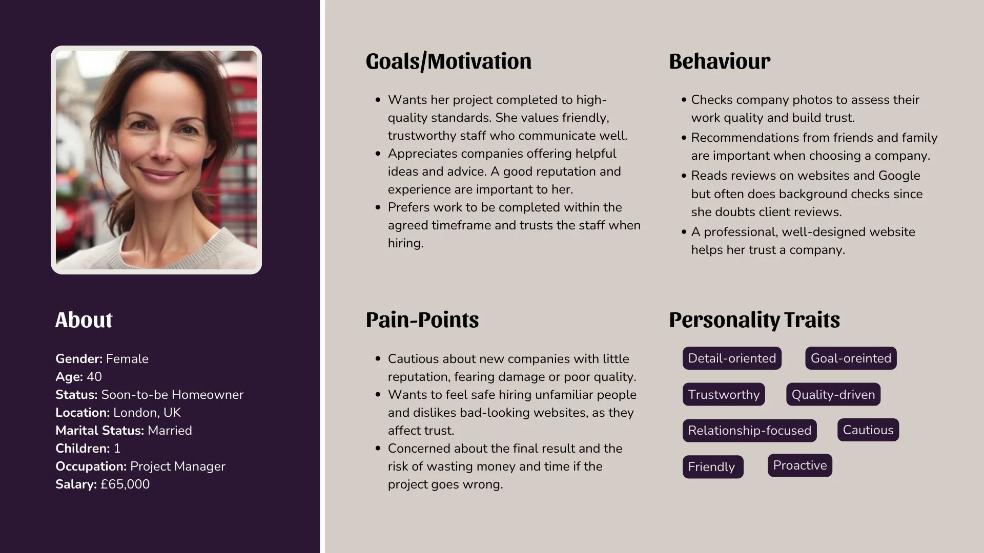

How might we…

…help people feel safe and confident and be provided with transparent information about the quality and work when hiring a company to fix their house.

Crafting solutions
Sketching the foundation for a website built on trust and quality
Sketches
These sketches were created to quickly lay out the structure and design of the website.


Laying the groundwork
Low-fidelity Wireframes
I then began by roughly placing the elements and laying out the structure, using rectangles to represent text areas. This helped me visualise the flow and ensure everything had its place before moving forward.


Refining the experience
Wireframes & Iterations
I moved to mid-fidelity to add more detail, making it easier for users to understand during testing. As you can see below, there's not much difference between the two, as they primarily have the same structure but are now in mid-fidelity for better clarity.


Round 1 of user testing feedback…


Right side is after testing (Iteration 1)
Left side is original wireframes


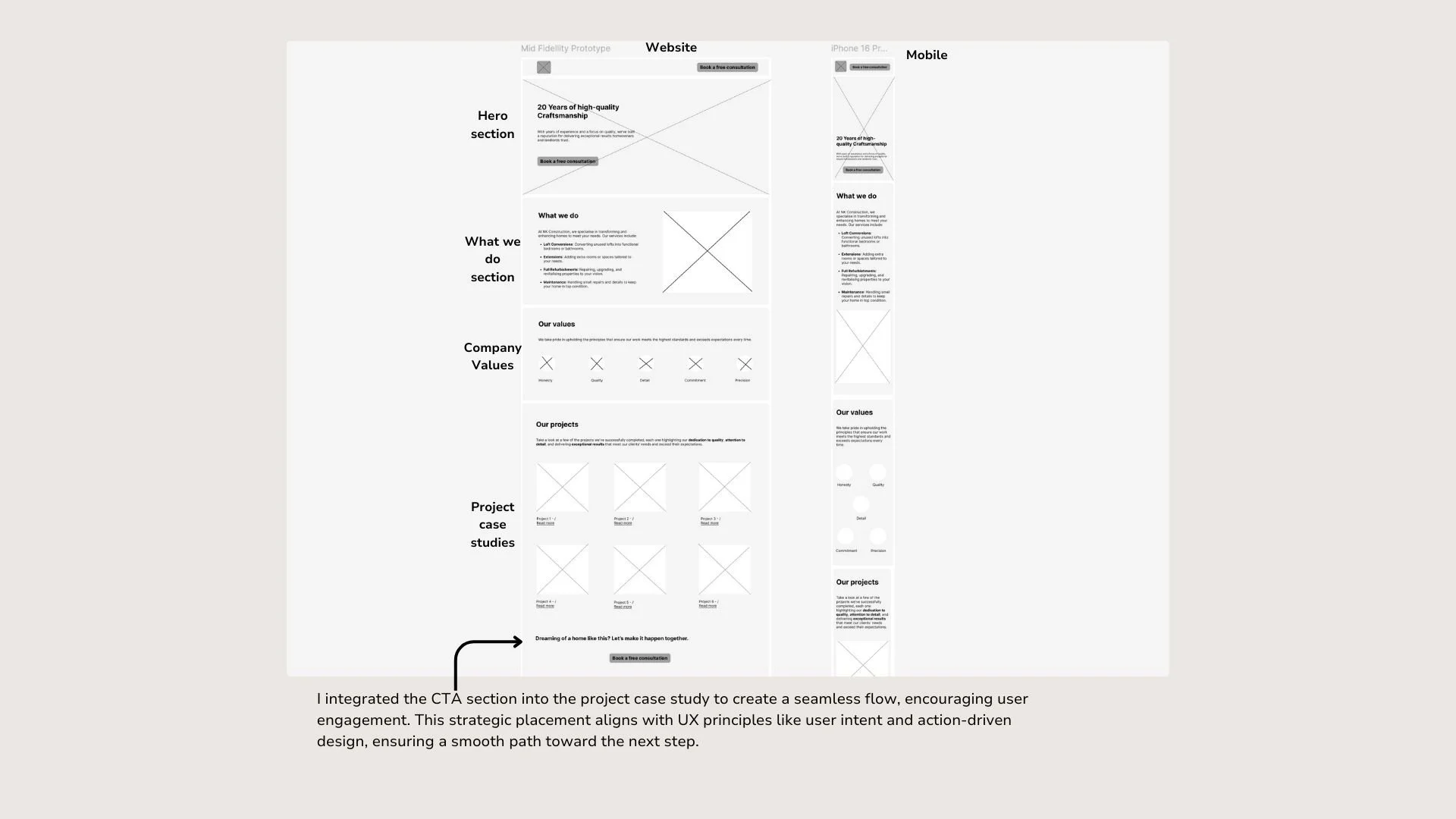
New addition to the wireframes
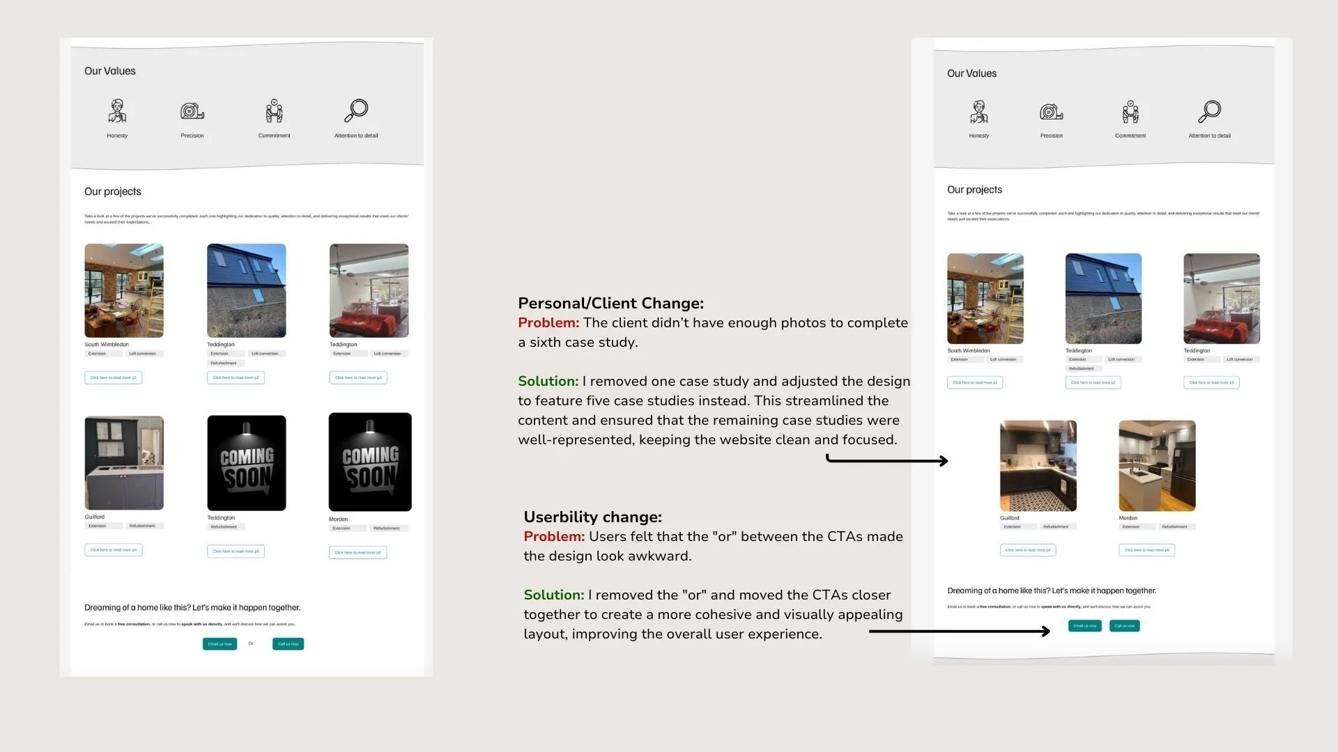
I was able to add this case study section after the first iteration, as during the initial round of user testing for the mid-fidelity design, I didn’t have enough time to complete it. I prioritised getting the design tested but made sure to include the case study section after my first iterations so that I could test it in my next round of user testing.

Round 2 of user testing feedback…


Left side is before testing (Iteration 1)
Right side is after testing (Iteration 2)


Round 3 of user testing feedback…

Right side is after testing (Iteration 3)
Left side is before testing (Iteration 2)


Round 4 of user testing feedback…

Left side is before testing (Iteration 3)
Right side is after testing (Iteration 4)


New addition to the wireframes
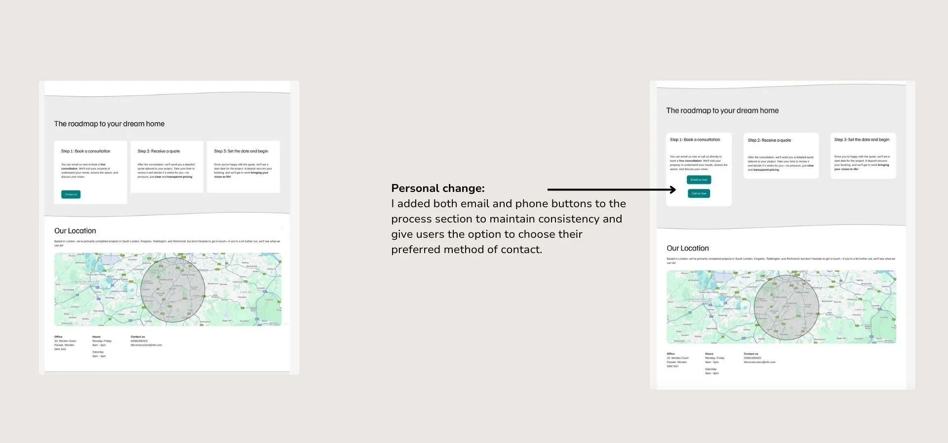
I added a project gallery as a new tab after user feedback indicated that having it on the homepage made the page too long, which caused the content underneath to be less visible. Moving it to a separate tab helps improve visibility and makes the layout more balanced.


Round 5 of user testing feedback…

In round 5 of usability testing, users reported no issues navigating the design and praised its intuitive layout. They found it easy to locate what they needed, with positive feedback highlighting the design’s clarity and usability.

Finalising the Design
Finishing touches for a seamless experience
The final steps I took to finalize the design before presenting it to my client and publishing were focused on refining the details:
Copywriting Review: I carefully reviewed all the copy to ensure everything was well-written, clear, and polished. This step was essential to deliver a professional and cohesive presentation.

Client Testimonials: Initially, the design included a section for client testimonials, but since my client couldn't obtain testimonials in time due to the timing of past projects, I temporarily removed this section. Once testimonials are available, I can easily add them back in.

Adjusting Rounded Corners: The original design featured squares with rounded corners set to 20, which gave the design a more playful feel. However, the company’s brand needs to balance friendliness with professionalism. To achieve this, I reduced the corner radius to 8, creating a smoother and more polished look that aligns with the brand's identity.

Refining Borders: I removed the thick borders from the grey sections of the design. This change enhanced the overall flow of the design, creating a cleaner and more seamless appearance by preventing the borders from drawing unnecessary attention.

Footer Changes: The footer underwent significant adjustments. Initially, I planned to include an anchor link. However, as I’m still figuring out how to implement it effectively, I simplified the footer by leaving only the logo and social media links for the moment. This streamlined version ensures functionality while I explore the best approach for anchor links.

To validate these changes, I conducted a quick informal usability test with three individuals, given the deadline. Their feedback confirmed that the adjustments improved the overall look and feel of the design.
These final tweaks ensured the design was both professional and aligned with the client’s vision, ready for presentation and publication.
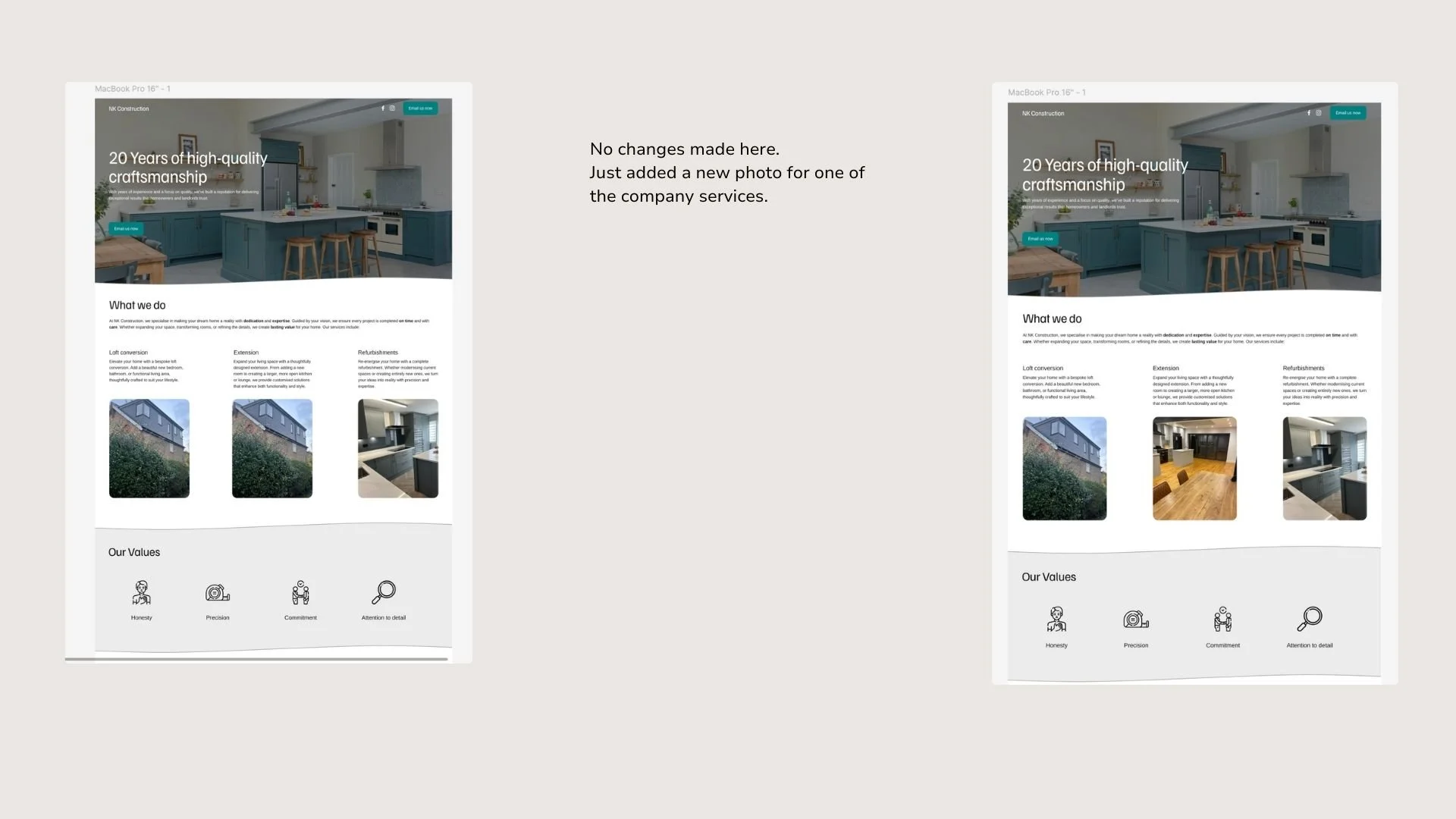
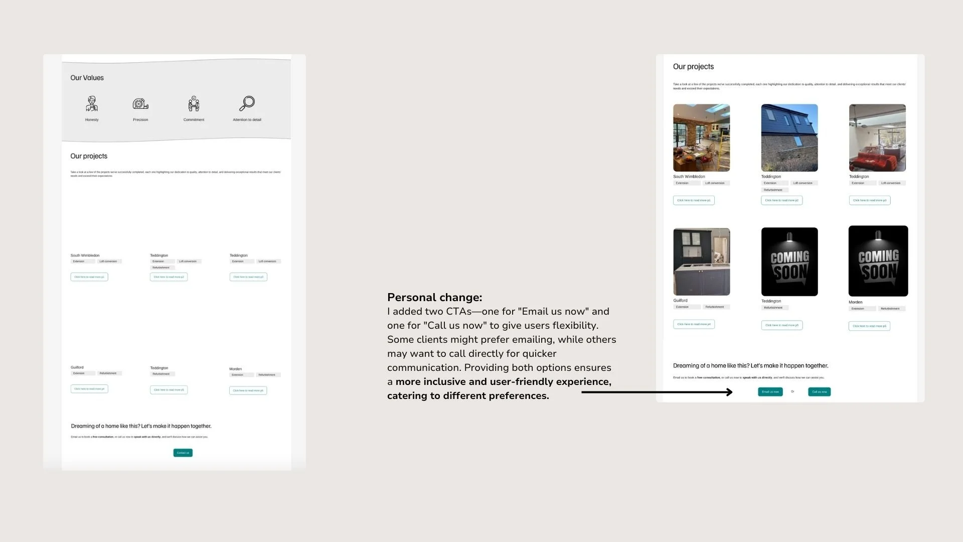
The final design

Kind words from my clients
Client Testimonial


“Edona created our website for our company NK Construction and she did a great job. She was really kind and easy to work with and always explained what was happening and what the next steps were. She made the whole process simple and clear for me. I’m very happy with the website she made and would definitely recommend her to anyone who needs help with their website.”
- Esat
“Edona did a fantastic job creating a website for my company, NK Construction. She was easy to talk to and kept me updated throughout. She made sure everything was done smoothly. I’m really impressed with the result and would definitely recommend her.”
- Qamil
Key learnings

I learned how to use Squarespace to design and launch a fully functional website. This experience helped me understand its features and flexibility, enabling me to efficiently create a responsive site for NK Construction.

Since this was my first real-life project, I learned how to communicate effectively with clients, especially when they were busy. I had to stay proactive to keep things on track. There were times when the client didn’t fully get the design process, so I simplified my explanations to make sure we were on the same page.

I learned how crucial it is to test design choices to ensure they work for users. For instance, I wasn’t sure about the placement of the 'Meet the Directors' section, but testing helped me confirm it was the right choice. Since the client didn’t have much design input, I had the freedom to focus on making the user experience seamless while still meeting their needs.

I’m really proud of the website. I focused on making it user-friendly and visually appealing while staying true to the persona. I found a great balance between design and functionality, and I’m happy with the result. This project taught me how to blend creativity with usability for a smooth user experience.
Next steps for the design process

Review Mobile Layout: As I progressed with the project, SpaceSquare automatically made the website responsive. I’ve only had to fix small issues, but I still want to review the mobile version and test it with users to ensure it’s easy to use and meets their needs.

Interactive Features: While SpaceSquare automatically made the website responsive as I worked on it, I was still learning some features, so I didn’t use many interactions. I want to try adding a few more interactions that will enhance usability on both laptop and mobile. I plan to conduct A/B testing to gather feedback from users of different ages and see their preferences.

Learning New features: I want to keep learning new features on SpaceSquare, exploring its capabilities, and developing both my UX and design skills to continuously improve the website.